There can be no doubt that winter is upon us, or upon me I suppose, since I cannot claim to presume that the icy grasp of winter has somehow managed cover the entire span of geography inhabited by the population of the internet. At any rate, it's bloody cold. Bone chilling cold. Nearly cold enough to make smoking unpleasant. Lucky for me that it's only "nearly" that cold since while I was shivering outside, destroying my lungs, I noticed that it is also berry-freezing cold and that it looked kinda cool.
So I did what any good procrastinator would do during work hours, I grabbed my camera and took a picture of the flora outside my lab. I very briefly (cold weather and all) checked the picture on my camera LCD then got back to work. Loaded up Lightroom a little while later and saw this, disappointed to say the least.
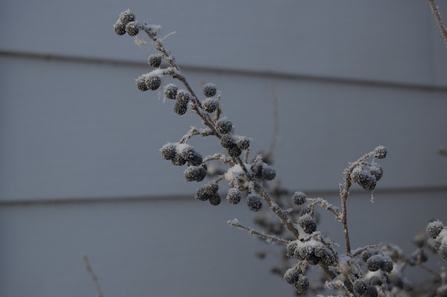 |
| Really ... I wanted a picture of this? |
The composition and focus were right ... but the picture looked terrible. Specifically, the whole thing looked blue and drab. Part of the drab I knew was impossible to fix, Edmonton in November isn't exactly the most colourful locale, but I certainly had an idea about how to fix the blue tinge. So I took the unfamiliar step, or click, into what Lightroom calls the "Develop Module". Carefully scanning the unfamiliar sidebars before me I happened upon the white balance and a handy dropper icon. Thanks to some limited experience with MS Paint I enthusiastically clicked the dropper over a part of the background wall that I figured should be white, and my simplistic assumption about what would happen was correct ... the colours were better.
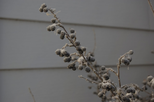 |
| The blue is gone, too bad it still doesn't look right |
Buoyed by the improvement I saw in a split comparison I proudly posted my masterpiece. Reviewing my work I was overcome with a feeling very similar to when I'd viewed the picture on my computer screen the first time, that it didn't look good. I was apparently so enthralled with the reduction in the blue tinge that I failed to notice that picture was still much more drab than I had intended. As an aside, I should have paid more attention to the LCD on camera.
I'd be damned if I was going to let my first, simple, stab at editing provide results I was quite that disappointed with, so off I went to find the exposure compensation. +0.95 EV later I finally had something that I could look at and not wonder what on earth I was thinking!
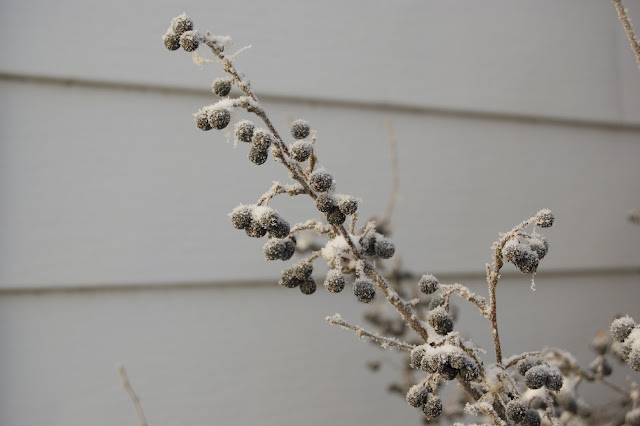 |
| Frozen berries - Edmonton, AB - Nov 2010 |
It's still not a vibrant photo, but it finally had the frozen aesthetic that made me want to take the picture in the first place. The edits really only took a couple of minutes at most, they're roughly the most basic tweaks I could possibly be making to my pictures, but I figured the results were interesting enough to show. I added the final version to a
Gallerama gallery containing assorted pictures from around my lab.
Update: It has been pointed out to me that the white balance dropper should actually be used on a grey standard, which certainly explains why I ended up getting the best results using it on the darker portion of background wall and lousy results when I tried to use it on the snow.


No comments:
Post a Comment